
Wednesday, December 10, 2014
Tuesday, December 2, 2014

Tuesday, November 18, 2014


Tuesday, November 11, 2014

Monday, November 3, 2014

For my final Project I would
like to map the number of children who have been accepted by the United State’s
government in the memorandum called Deferred Action for Childhood Arrivals
(DACA). This memorandum allows immigrant children to legally live in the United
States. I chose this topic because not many maps if any have been created on
this topic since it is fairly new. This topic also interests me because I come
from an immigrant family and it is difficult to migrate to this country and not
be legally able to live here.
I want this map to be
informative to people who have a passion in immigrant studies. Since it is hard
to find information about this topic I want my audience to be anyone interested
in immigration policy and overall government officials so that they can see the
states that have the most migrant children.
The type of map I want to
create is a Cholorpleth map or a proportional symbol map because these types of
maps are more suited for my information since they are whole numbers. A
Cholorpleth map would be useful because different colors would definitely help
differentiate where migrant families live. A proportional symbol map would also
be suitable since some states have higher populations of migrant children than
others. The scope of map would be the 50 states because migrant children live
all over the United States and since I have information I might be able to
include US territories.
The Data I have found is
from U.S Citizenship and Immigration Services. The year I am using is the 2014
information because it has the up to date information of the amount of accepted
DACA children. The data has information on all 50 states and it is very complex
since it has a big range. I think the information portrayed is very accurate
because the states with the largest numbers are really the destination points
for many immigrant children.
The basemap I need for my
map is the United States, Alaska and Hawaii and may include the US territories.
I want to start by adding my data to an excel sheet that way the process to
make my map is easier. I also want to have my basemap ready and within the next
week either my color schemes ready or my symbol to really start working on my
map. My main challenge is focusing on what kind of map I want to create. Another
challenge is working with the large range that my data has because several
states have really large numbers. Lastly, will be the amount of time I have to
finish the map because it takes a long time out of class to work on these maps
so they look professional.

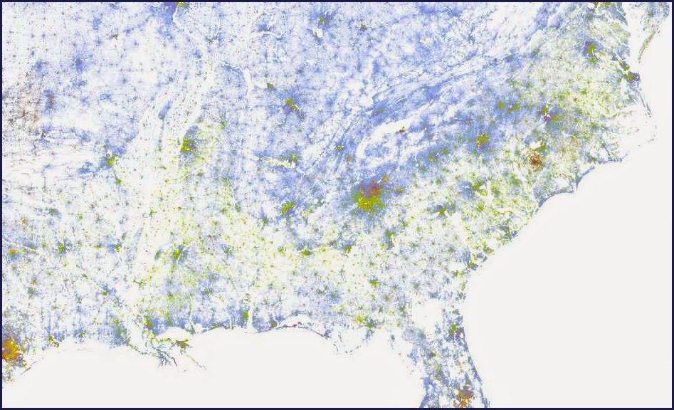
This is a map that is closely related to my topic but it is out of date because this is what the government thought the map would look like after DACA was passed.

Thursday, October 30, 2014

Tuesday, October 28, 2014

This is a proportional symbol map I found online of fatal crashes for ages 65 and up in the United States. Symbol
Thursday, October 23, 2014

Tuesday, October 21, 2014

Thursday, October 9, 2014


Thursday, October 2, 2014


Thursday, September 25, 2014


Tuesday, September 16, 2014

Thursday, September 11, 2014


Thursday, August 28, 2014
My First Map
Here is a map of the elevation of Honduras.
 I chose this map because I am from Honduras and I always wonder why people live up in the higher elevations of Honduras.
Subscribe to:
Comments (Atom)